

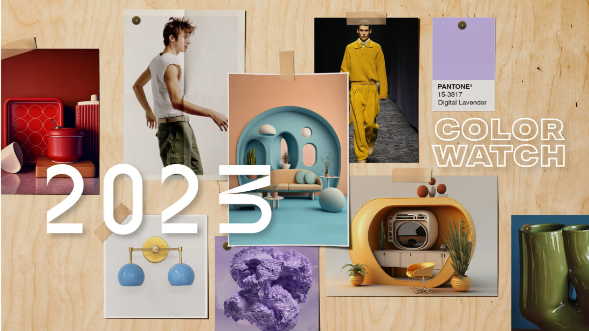
It’s January and it seems like many brands have each announced their own “color of the year.” We have to thank the original “standard” in color, Pantone, for starting that whole trend. For 2023, Pantone announced their annual Color of the year as “Viva Magenta.”
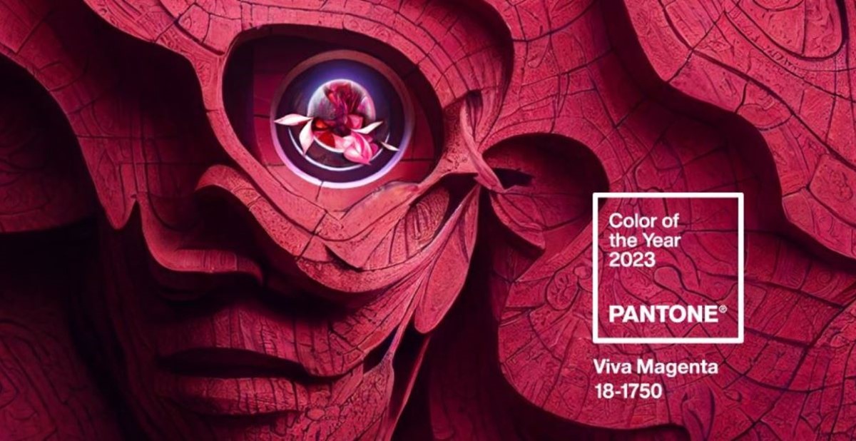
So… yeah. I dunno. It’s like… a berry tone? I love a jewel tone and would love to see more returning, but this just feels a little… off? Last year (2022), we saw the prominence of hot pink, with “Valentino” pink and the whole “Barbie-core” happening as examples. There was even a lot of that bold bright Green trickling down from 2021 (made a thing thanks to Bottega Veneta), But Pantone had dubbed “Veri Peri” their color for 2022, which was more of a blue-based lighter purple. And I don’t recall that being a popular color out in the world last year. Honestly, the last time I felt Pantone hit it on the head with “color of the year” was in 2016. They announced the controversial double color combo “Rose Quartz and Serenity” (which was what became “millennial pink” and a light blue). Understandably, trying to predict the future is not a perfect science. The last few years have shown thing can change unexpectedly and very quickly.
Digital Lavender
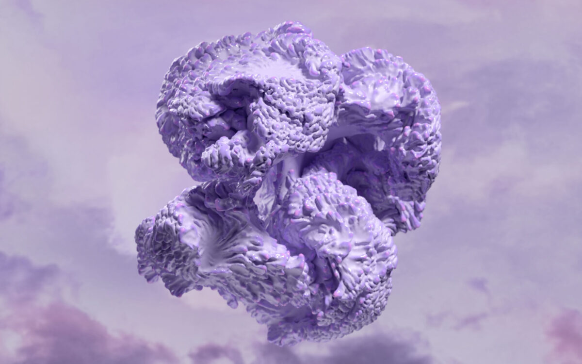
One source that has a better track record for me has always been WGSN. Those of you in the apparel industry should be familiar with WGSN. It has become one of the most relied-upon trend resources for designers. They forecasted in 2021 that “Digital Lavender” would be the color for 2023. I’ve been a fan of lavender for a few years now and have recently seen it rise in the market, so this color feels more accurate.
“Purple will return as a key colour for 2023, representing wellness and digital escapism. Recuperative rituals will become a top priority for consumers who want to protect and improve their mental health, and Digital Lavender will connect to this focus on wellbeing, offering a sense of stability and balance. Research suggests that colours with a shorter wavelength, such as Digital Lavender, evoke calmness and serenity. Already embedded in digital culture, we expect this imaginative colour to converge across virtual and physical worlds.
Digital Lavender is a gender-inclusive colour that is already established in the youth market, and we expect it will broaden into all fashion product categories by 2023. Its sensorial quality makes it ideal for self-care rituals, healing practices and wellness products, and this purple will also be key for consumer electronics, digitised wellness, mood-boosting lighting and homewares.”
Will “Viva Magenta” be everywhere? or will “Digital Lavender” prevail as representative of this time? I guess only time will tell… In the meantime, here a few other colors that I currently am obsessing over and have been keeping my eye on. I’m not saying these will be “color of the year”, but they are ones that I think could bring some freshness to your visual palette.
Olive

If you’re looking for a new “neutral”, Olive is a great alternative. I’m really loving the idea of seeing Olive in interiors, especially in fabrications. A muted drab military fatigue green cotton fabric would look so cool as upholstery. It works with so many colors and has a calming and “grounding” effect.
Red

On the opposite spectrum, unlike the blue-er toned “Viva Magenta”, I’m more excited about the prospect of a true Red. Think Ketchup red. Red is a very powerful color and can be ovewhelming, but I love seeing it as an accent. It adds a pop of energy and drama. I’m also loving the idea of a return to a ceramic brick red tile, which was popular in the late 60s and throughout the 70s in many business and retail spaces.
Mustard Yellow
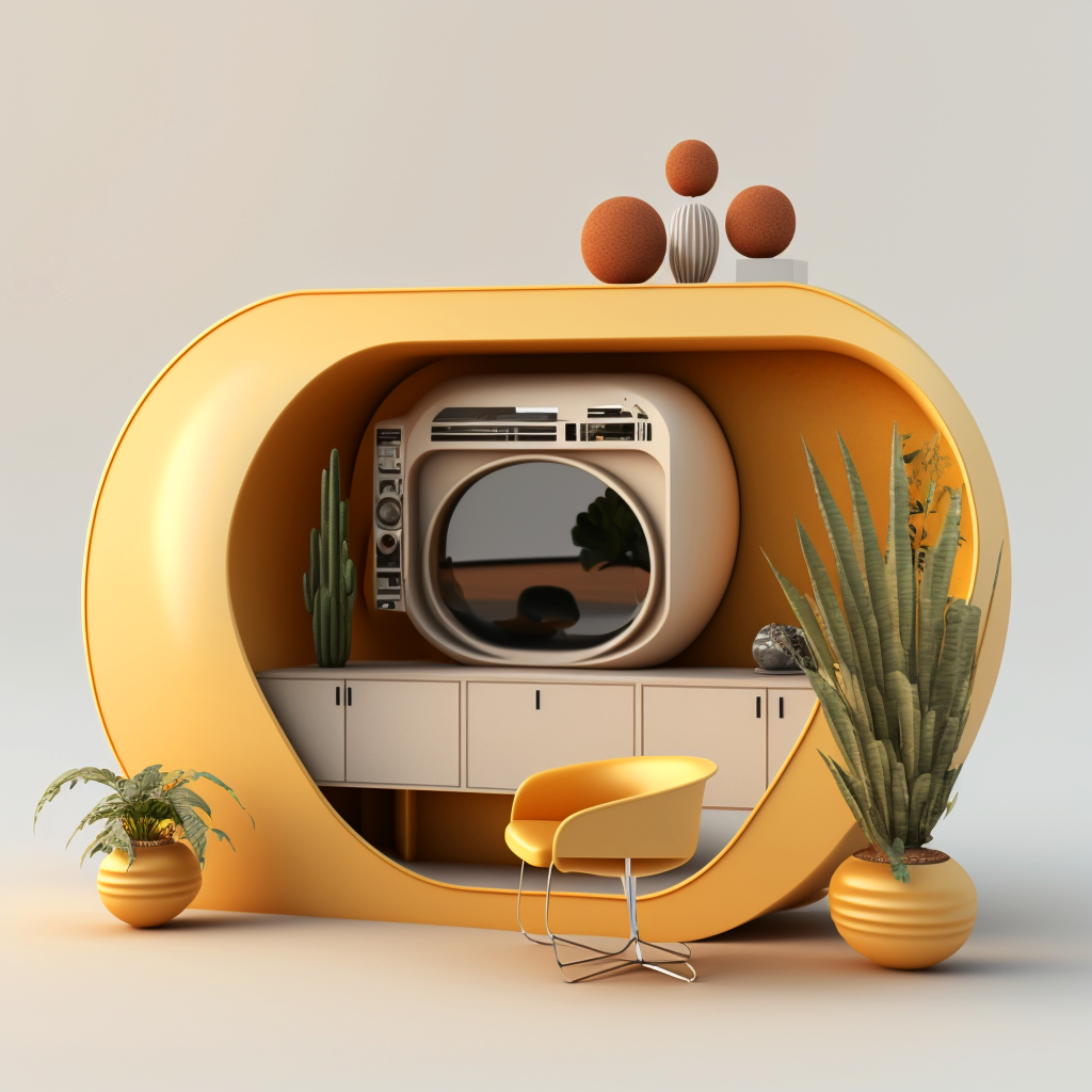
If you have ketchup, then of course you’ll need mustard! Well, ok maybe not together, but I do love a slightly muted rich yellow. Mustard yellow or even more of a “goldenrod” yellow has been popular the last few years, but usually used an accent and in conjunction to terracotta or peachy earth tones. I’d like to see it have more “main character energy”. Yellow is also just a “happy” color, and we definitely could use more of that in our lives right? The recent Zegna Men’s Fall 2023 show featured it and I’m just saying sign me up!
Finally a tale of two blues…
Light Blue
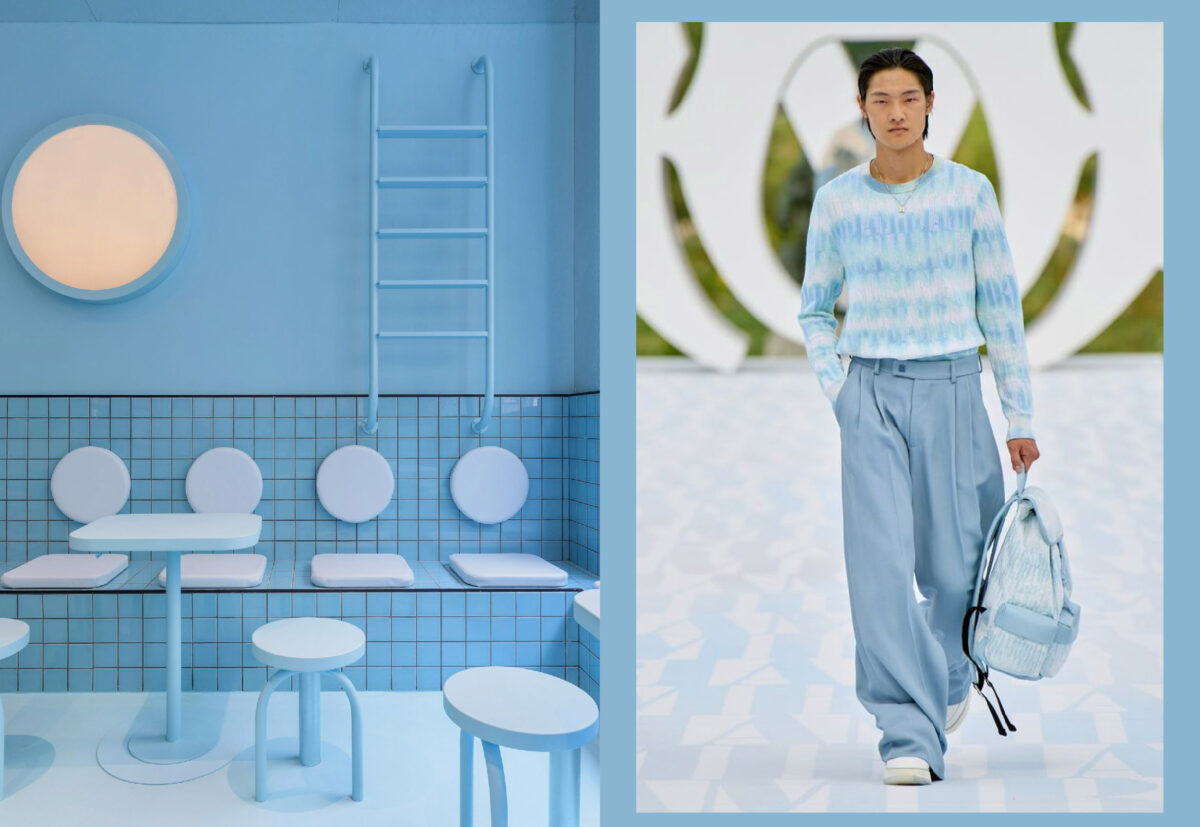
I don’t really know what to call this color… light blue? sky blue? but basically it’s a softer, almost chalky? tint of blue. It’s doesn’t have the green undertone as a “robins egg”. I remember being very into this color in the mid-to late 90’s for some reason. Regardless, I think it’s due for a comeback!
Cyan Blue
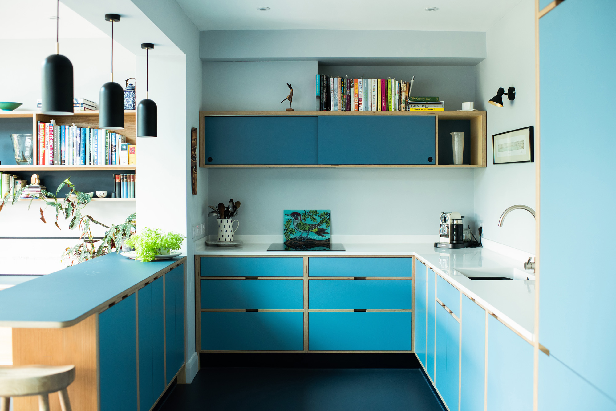
I’m also having a hard time naming this blue. Cyan? Cerulean? It’s not exactly Turquoise… but basically think Process Cyan if you’re familiar with print inks. Another color I have loved forever, but it really caught my eye a few years ago when Toyota started introducing cars in their “Blue Flame” color. I like it because it can feel both vintage and modern/futuristic at the same time.
So those are the colors that I’m currently eyeing. Are you feeling any of them? What colors are you obsessing over right now? Would love to hear! Shoot me a DM on Insta or an email and of course if you haven’t already, please sign up to my newsletter to keep up with all the shenanigans