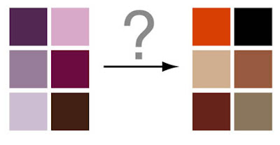
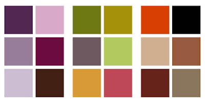
 The first major issue that I had to tackle for the parental’s family room makeover was color. You have this retro 70’s orange/black/tan vibe vs. the purple/pink/dark browns look that sort of flows in from the living room. So whattyagonna do? I’ve always found that when you’re trying to make contrasting colors blend, the answer is what I call, buffer colors. This basically means colors that you add in to form a new colorstory and help transition all the colors together.When I try to decorate any room, it usually helps me to start with one object/thing/inspiration that ties together all the colors. Granted, this isn’t always needed, but it always helps me. It can be found in anything… a piece of artwork, or a fabric… a tchotchke… anything… After looking around, I actually realized I already had found the answer. A pillow I had purchased awhile back for them from Pier 1.
 The shimmery silky fabric had all the colors from the living room, but also some new colors, like some greens and the orange I was trying to figure out how to incorporate. The key color it turned out was that green. I needed to inject some olive-y yellow-y greens to act as my buffer color.
 So… now that I had a color game plan, I could move on to the next step… figuring out what to get rid of and what I needed to get… (to be continued)…
