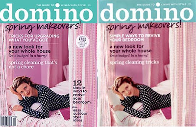
 There’a an interesting discussion going on at AT:NY, about how Domino is going to start trying out two different cover formats. One that is more clean, and the other that is normal with lots of type. The clean version would go to subscribers, much like what Wallpaper magazine does. I personally love my clean Wallpaper versions, which was added motivation to subscribe. There’s also debate about the bold color bar for the masthead. Personally, I don’t mind it at all, and actually like it. It gives a distinct look on the newstand, and as a graphics person, I’ve always been drawn to colorbars. What do you guys think?
(UPDATE: thanks to Dani for showing me the other version of the May cover- I’ve updated the image- not shockingly different…)
