
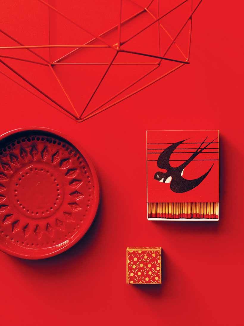
If you love interiors like me, you’ll probably agree that the best ones are spaces that are created out of an unexpected mix of different elements. The juxtaposition of these pieces usually will say so much more about the person that lives there than a space that is over coordinated or uses too many clichéd themes.
Most people go by an instinct to put their things together, but even seasoned pros will come across times when they can use some inspiration on how to put it all together.
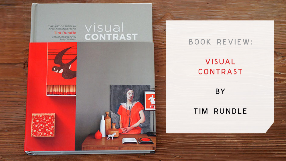
Tim Rundle, an interior stylist with a background in graphic design, recently shared his styling secret when it comes to arranging objects: “Visual Contrast”- which also happens to be the name of his amazing new book!
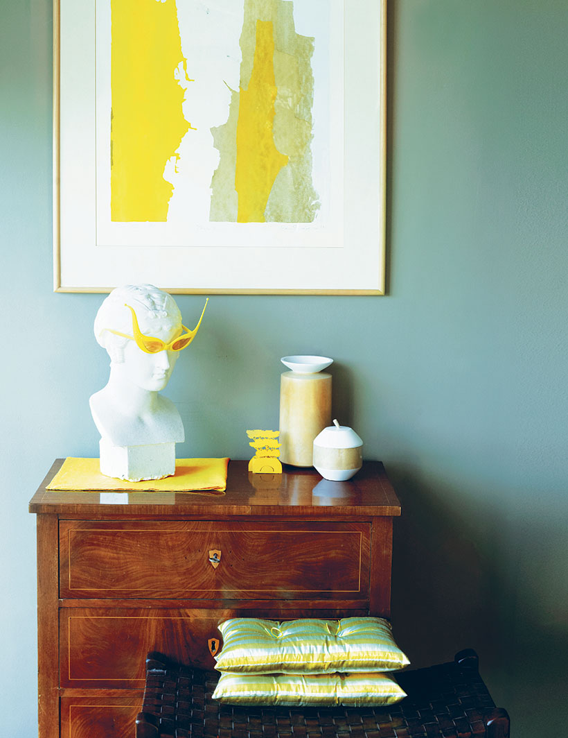
The idea behind “visual contrast” is basically the notion that sometimes in order to highlight one thing, it’s best to put up against it’s opposite. Tim gives a great example, you could highlight something modern by mixing it with something antique, or something ornate with something minimal or abstract.
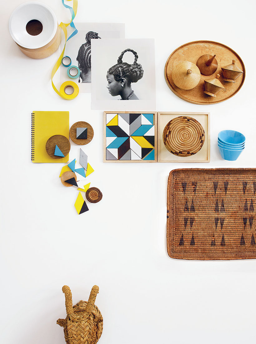
On a surface level, the images alone (all shot by Polly Wreford) are simply gorgeous and striking. However, you can then dig deeper to understand why these vignettes are so appealing via the accompanying essays and descriptive explanations.
The book is divided into four chapters- Shape, Color, Placement, and Personality. Tim goes into great detail, showing the key aspects of visual contrast and explains how these concepts can be used while also showing other examples of how these techniques have been applied in his own home.
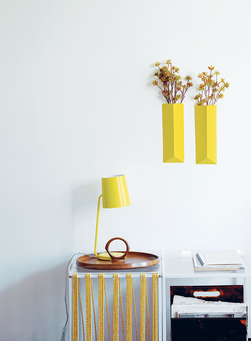
If you’ve been to my house, you’ll know I’m a big self proclaimed pack rat. I just love collecting little things and displaying them! I’ve never been able to articulate how or why I put things together, but Tim does a great job of explaining the rationale behind why certain groupings work well that I immediately connected with. As a fellow graphic designer, I also was immediately attracted to all the geometric accessories he mixes in, along with the fun pops of color in each vignette.
Another thing I love about Tim’s “visual contrast” philosophy is that it encourages you to not necessarily go out and get new things, but rather to just take another look at the things you already have and rearrange them to achieve a fresh look!
This book would make a great addition to anyone’s library that enjoys creating or can simply appreciate a beautiful arrangement. Check it out and get inspired!
Visual Contrast by Tim Rundle is published by Ryland Peters & Small and out now!
For more fun books I recommend- check out my “reference materials” collection on Luvocracy here.
All photos by Polly Wreford courtesy of Ryland Peters & Small. Layout/design by Jonathan Lo / j3productions